 Written by: Alana Elkins, Ed.D. // May 6, 2021
Last updated: May 13, 2021
Whether students are just starting their online learning journey or are already seasoned online students, logging into an online course at the start of a new semester can seem daunting. As an instructor, you have the power to reduce your students’ feeling of being overwhelmed, and even help them feel encouraged and excited to get started. Incorporating a landing page design in your online course offers similar benefits and avoids a few common pitfalls that your students might experience when opening up the course for the first time.
Imagine this scenario and put yourself in the shoes of your students: you’re in a productive mindset and are ready to take on your first day of online classes. You log in and all you see on your course home page is a blank page with no clear direction on where to start. What’s your first thought? You probably ask yourself something along the lines of: “Am I sure I'm in the right course? Where do I click first? Where is the essential information? What should I be doing today?” These are all common questions students ask when they open their course and see nothing on the front page, or even worse, when they are inundated with a grocery list of items that have no context. This can cause frustration, confusion, and waste valuable instructional and productive time. And think about the effect of that confusion or frustration. It causes students to contact you, the instructor, with questions that could be avoided all together by utilizing a well-organized landing page.
Any time you visit a website that belongs to a retailer like Microsoft or Apple, or an organization like Big Brothers Big Sisters or United Way, you immediately get a holistic view of who they are and their purpose just by looking at their home page. You are given relevant and distinguishing imagery that lets you know you are at the right site, in addition to an organized navigational menu, allowing you to easily move through the site and find what you need.
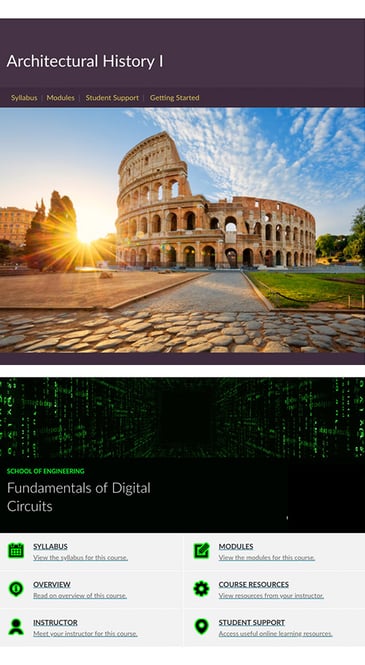
We’re sure at this point that you are on the edge of your seat! You might be asking, “what is a landing page, exactly?” and “what should be included in a landing page for an online course?” Thankfully, we've got you covered! Our USF Innovative Education Digital Learning team has put together several templated landing page options that you can customize for your course. Universal learning design principles are at the core of everything we develop, and that includes effective landing pages. Each landing page should have a banner image or banner text that gives obvious affirmation to your students that they are in the right course.
For example, if you're teaching architecture history course, consider using something like an image of the Colosseum in Italy and adding the title of your course to the page in a clear font.  Once you've clearly established (visually and/or textually) your course's visual identity, it's helpful to add a navigational menu that directs students to the most important components of the course. Typically, this includes links that take students to the syllabus, technical support, required/critical course resources, and to wherever students will be accessing the course content (typically modules). Last, but certainly not least, don't forget to put yourself on the landing page! Make sure your name is visible and include your preferred contact method. Adding your information to the landing page, makes it clear from the get-go that 1. you are the instructor, 2. you welcome their questions and content inquiries, and 3. they can reach you for assistance throughout the semester.
Still wondering whether or not a landing page will help your students succeed? We get it, no one needs "one more thing" to set up. In internal surveys, students overwhelmingly agree that a landing page made their course navigation easier. And, as if you didn’t already have enough reasons to start using a landing page, you should know that adding one to your course also meets several Quality Matters standards, an industry-wide tool used to benchmark quality. Think about all of this! A landing page will give your course a professional look and feel, promote student success, facilitate ease of use within your course, and hopefully avoid students asking the question "where do I start"?
USF Digital Learning is happy to answer any questions from USF faculty related to online course design.
