 Written by:
 Last updated: Oct 3, 2021
When you finally completed grad school and began your teaching career, you may have envisioned lecturing before a throng of students, and the satisfaction you would feel as you witness them grow in their understanding and discover their most rewarding careers. However, you may not have anticipated how much time you'd spend creating and curating instructional materials and compiling them into the nth PowerPoint presentation, agonizing over visuals, fonts, colors, and diagrams and hoping students appreciate the effort. While you may not cater to every student's aesthetic palate with your design choices, you can afford color accessibility for students with visual impairments. You may find that all students benefit from the steps you take to improve accessibility in your visual design.
Use the following tips to produce accessible learning materials by employing color purposefully in your instructional materials.
Tip 1: Don't rely solely on text color to communicate meaning
Sometimes you may choose to use color to draw distinctions between concepts or to emphasize selected text within a sentence.
For example, you may make a list of Pros and Cons in which you use green text to signify the Pros and red text to signify the Cons. If the list appears on a white background, students with red-green colorblindness will be able to view the text but will miss the distinction. Another approach could entail using an icon bullet or shape to distinguish the Pros and Cons.
-jpg-1.jpeg)
In another case, you may select a different font color for a few words within a sentence to indicate importance. Rather than relying solely on color, you could also bold or italicize the font for the selected word or phrase so that students with visual impairments can also recognize the cue.
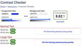
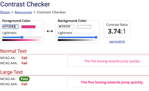
Tip 2: Maximize contrast
Text can appear to fade within the background for some learners if the color contrast is low. Thankfully, accessibility experts have devised many tools, such as color contrast generators, color contrast analyzers and accessible color palettes, to support lay designers in delivering visuals with appropriate contrast ratios and that conform to the Web Content Accessibility Guidelines. Ready-made ADA compliant color palettes can be easily found with a Google search, or if you want to experiment with your own color combinations, you can check the contrast level with the WebAIM contrast checker or a similar tool if you know the hexadecimal codes for your chosen shades.
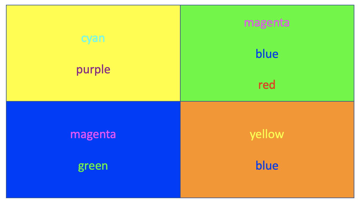
Tip 3: Avoid ineffective color combinations
Bright colors can add visual interest to seemingly dry materials, but certain color combinations can be jarring for some students and distract from your content due to an effect called chromostereopsis - in which colors are perceived to appear at different depths. This "vibrating" effect is pronounced when using red and blue together, but other color combinations produce similar results, so choose your colors carefully.
Other color combinations to steer clear of are red/black or yellow/blue. For learners with various forms of color-blindness, the information presented using these color combinations will be obscured.
It may be helpful to mindfully browse websites or graphics that were designed by professionals who are likely informed heavily by graphic design color theory. Pick a handful of your favorite websites and ask yourself what types of color schemes are used by professional designers? What can you gather from their design choices to inform your visual design?
Source: https://accessibility.psu.edu/color/brightcolors
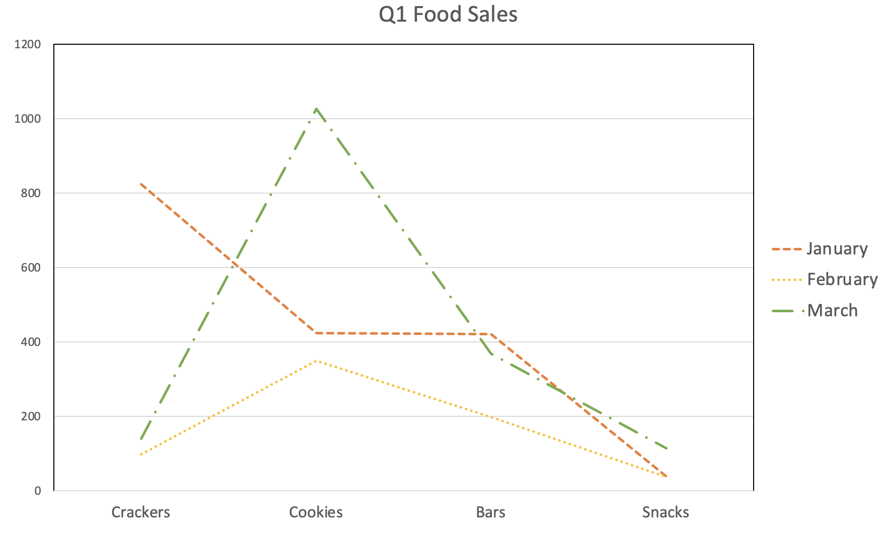
Tip 4: Check your charts
Comparative data is less meaningful to those with visuals impairments if only color is used to make distinctions. A more inclusive approach could include using tables to display the information, using black and white shades for contrast, or using textures or line styles to illustrate discreteness between values. Additionally, if your chart or graph appears as a photo on the Canvas page, always include alternative text (that is, text that describes a photo's purpose and visual characteristics) so that students don't miss the significance of the data you are presenting.
Tip 5: Use an accessibility checker
If you're not sure whether a design you developed would pass accessibility muster, there are several resources available online, and even within the Canvas LMS, that will take the guesswork out of designing for accessibility.
Incorporating these tips into your course design will enhance the inclusive learning environment, and designing while anticipating variability among your students brings you closer to universal access and adheres to Quality Matters guidelines. To learn more about how to support students with varying needs, stay tuned to this blog.